TL;DR – Here is full analysis. No, I will not tell you the answer, you will have to scroll till the end of this post to find out. With that out, let’s start from the beginning.
So, here is my behind-the-scenes struggle to pull out this analysis, where I wanted to find out what is best city in the whole wide world to live in! You probably don’t care about it and you just want to see results, but here you might also learn a thing or two. Let’s just say that my old time friend from university is on to something in his blog post where he praises Medellin?.
Why
Some 10 years ago, I was very frequent in Bay area (San Francisco). No matter what time of the year I was there, it was always nice weather. “Nice” here means 22°C – 25°C, no rain, no snow, in that special goldilocks area where it is never too hot and never too cold, perfect for bermudas and short sleeves. Basically, it was bloody constantly perfect throughout the year! OK, sure, you might get some fog down in San Fran:

or some harsh winds on beach in Carmel in winter:

but yes, overall it is mostly like this:

So, while entertaining myself with thoughts of going abroad and/or becoming expat, one important dimension to always think of was weather. If I am ever off to somewhere, I would prefer it to be with weather similar to that of Bay Area!???
Getting the data
I knew I need to get my hands on all temperatures from all cities worldwide, but didn’t know where to start. I was thinking there will be some free sources that gives you these kind of data, but I was wrong. It was either for some region, or some historical data, or some data that seemed OKish, but included some weird, expert metrics and abbreviations (did I already told you that I have no connections to meteorology whatsoever??). Don’t get me wrong, I am fairly sure that data is out there somewhere, but my DDG-fu was too weak in this case.
OK, so I thought, let’s look at Wikidata, it has everything. But even there, there was no climate data (although I was seeing those climate boxes in Wikipedia?). So, next thing to check was those climate boxes. If you never noticed any of them, well, head over to any city in the world in Wikipedia and look for a section, usually called “Climate”, such as in this example.

This approach was far from perfect, as this data (as I learned along the way) varies greatly in what is presented, sources that data is taken from, location that data is taken from, units, year ranges… But hey, I had luxury of writing that all off, and use it as very good first approximation.
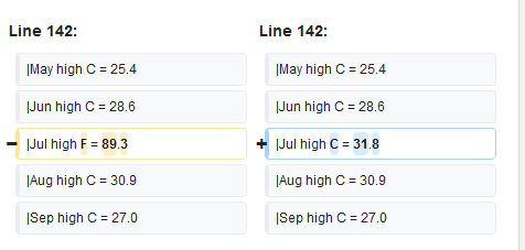
All I had to do was to find all cities in the world from Wikidata using SPARQL and scrape climate data for those cities from Wikipedia. Same as with my previous explorations in Wikipedia world, I used pywikibot for scraping again. I don’t want to bother anyone with details, but let’s just say that climate data in Wikipedia is not quite uniform?. However, working with open ecosystem means that I got to fix data directly at the source. I do not need to have another layer of data overrides or to complicate parsing, or any of that stuff. Problem is therefore fixed at the root and neither me, nor anyone else, will ever have to worry again about this. Here is what I am talking about:
Final fruits of my labor (read: Python scraping code) are nicely archived at Github, if anyone wants to add support for scraping more stuff (I didn’t scrape every little stupid thing, like average snowy days per month), or just want to learn how reading Wikidata and Wikipedia works. Also, final produced dataset can be found here, if you want to play with it.
Doing the analysis
Getting the data and data analysis was something I was doing before and that I was comfortable with. Presenting cartographic data was something completely new for me. Also, finding best platform to presenting data was also somewhat interesting.
I first started by using barebone Leaflet, setting up local JS env, but quickly gave up on that. I figured out it would be non-trivial to include that analysis in this (WordPress) blog, and that work would only comprise presentation of map data, not of other stuff, like code, regular tables, graphs… which I would have to deal with myself, something I was reluctant to do. So, I opted for Kaggle as platform (yes, I am such a mainstream), as it could host my scraped data, allow others to mix it, and host Jupyter notebook along with visualized data. BTW, library to visualize maps in Jupyter is called Folium.
Aftermath says that I didn’t lose that much going this route – only thing that I think I lost was inability to show worldwide heatmap of average temperatures. I think that best way to do this is by using “inverse distance weighting” (or IDW) and those Leaflet plugins I could find were not supported by Folium. So, instead of presenting temperatures like this:
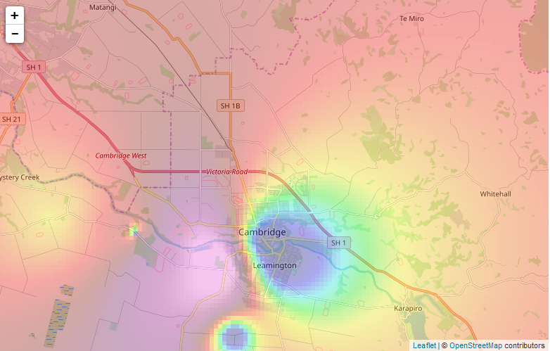
I had to resort to something like this:
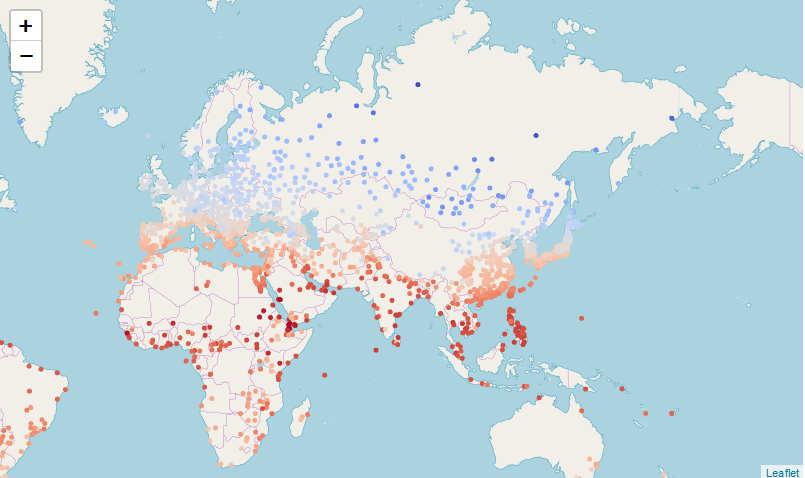
I am still not sure about relationship between Leaflet and Folium, but my understanding is that Folium is wrapper for Leaflet for data visualization in platforms like Spyder and Jupyter. That being said, I think some hacker could surely make IDW work even in Jupyter (let me know if you know how!), but at that point, I didn’t bother with it.
Other than that, I didn’t have much problems. Heck, I even found San Francisco in data set of cities with least fluctuations in temperature! I also liked very much how scatter plot of average temperatures against latitude (latitude in absolute terms, so both southern and northern hemisphere) is giving cosine function!
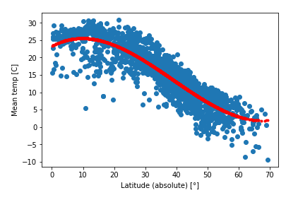
Actually, I am not sure if this is cosine function, but it surely looks like one. Also, Earth is sphere, and I highly suspect cosine could easily creep in any physical properties there, so yeah, in my book, this is cosine?.
At the end of the day, when you take into account:
- how warm some city is, and
- that temperatures do not fluctuate much (stdev is low),
you end up with… South America. Yes, in top 30 cities, more than 50% is from South America! No Europe and no North America here. And if you look only for average temperatures above 20° C, Medellin takes first place. Go look original analysis in Kaggle, as it offers more interesting insights, and I will simply wrap this post with list of top 30 cities with population over 1.000.000:
| # | Country | City | Avg Temp | Score (some magic) |
|---|---|---|---|---|
| 1 | Ecuador | Quito | 15.6 | -0.001299 |
| 2 | Colombia | Bogotá | 14.5 | -0.001241 |
| 3 | Ethiopia | Addis Ababa | 16.3 | -0.001087 |
| 4 | Colombia | Medellín | 22.5 | -0.001081 |
| 5 | Kenya | Nairobi | 17.8 | -0.001042 |
| 6 | Uganda | Kampala | 22.7 | -0.001040 |
| 7 | Colombia | Cali | 23.9 | -0.001030 |
| 8 | Venezuela | Caracas | 21.1 | -0.001006 |
| 9 | Brazil | Brasília | 20.6 | -0.000973 |
| 10 | Mexico | Mexico City | 17.5 | -0.000931 |
| 11 | Venezuela | Barquisimeto | 24.8 | -0.000901 |
| 12 | Mexico | Puebla Garcia | 17.2 | -0.000892 |
| 13 | Brazil | Belém | 25.9 | -0.000882 |
| 14 | Honduras | Tegucigalpa | 21.7 | -0.000859 |
| 15 | Cameroon | Yaounde | 24.2 | -0.000847 |
| 16 | Brazil | São Luís | 26.1 | -0.000830 |
| 17 | Brazil | Goiânia | 23.2 | -0.000792 |
| 18 | Indonesia | Jakarta | 26.7 | -0.000777 |
| 19 | Brazil | São Paulo | 18.6 | -0.000772 |
| 20 | Brazil | Fortaleza | 26.5 | -0.000759 |
| 21 | Yemen | Sana'a | 16.2 | -0.000739 |
| 22 | Madagascar | Antananarivo | 18.3 | -0.000735 |
| 23 | Brazil | Belo Horizonte | 21.9 | -0.000729 |
| 24 | Brazil | Curitiba | 16.8 | -0.000721 |
| 25 | Peru | Lima | 19.2 | -0.000719 |
| 26 | N. Zealand | Auckland | 15.1 | -0.000703 |
| 27 | Brazil | Maceió | 25.2 | -0.000701 |
| 28 | Guinea | Conakry | 26.4 | -0.000697 |
| 29 | Brazil | Salvador | 25.3 | -0.000692 |
| 30 | Colombia | Barranquilla | 27.4 | -0.000674 |
I think that you should add humidity as a factor. At least for me, it plays a huge role in how I feel. High humidity makes both, warm and cold, weather less bearable.
Agreed! Can’t stand humidity!
Exactly Bojan, I’ve just realized that and came to make the very same comment! :)
For example – Barranquilla is on the list and it’s super humid and I can’t stand more than 3 days there, not even to think about living.
Hey Branko, nice one! :) Nice to hear from you after so many years. So interesting how we came to the same conclusion about Medellin, you with scientific approach, and myself with practical one – traveling :))
Why is Venezuela up there?
It’s not safe there anymore
Weather do not care for safeness of area:)This post, and I think it is quite clear, is not indended as “find you next perfect vacation idea”. If it is not clear, well.. Darwin award to whomever use this blog post as vacation advice:)
Next, cross the data with average income per-capita in usd and that is going to give you the best places to live and make money. I imagine San Fran to be much higher now.
Yes, if you peek into original analysis in Kaggle (https://www.kaggle.com/brankokokanovic/best-city-to-live-in), San Francisco was pretty high (8th in low temperature variation among all cities with population over 500.000). I also think it will pop-up as first (or second behind Auckland, NZ), but I purposly didn’t want to go in socio-economic analysis;)
“Climate Best By Government Test.”
https://en.wikipedia.org/wiki/Redwood_City,_California#Slogan