All data presented here is available as spreadsheet.
World population grows exponentially. Can we graph accurately world’s births and deaths since the dawn of the civilization? Of course not, but in this post I will try something (that I don’t think) anyone tried before. Idea is simple – every wikipedia article about a person has a category that is like “YYYY births” and “YYYY deaths” (if that person is dead). We can use this metadata to create a graph depicting births and deaths in that specific year. I used Pywikibot to fetch this data. Here is the source code:
#!/usr/bin/env python import wikipedia as pywikibot import catlib def main(): site = pywikibot.getSite(code='en') for year in range(1, 2010): #cat = catlib.Category(site, "%s:%s" % (site.namespace(14), "%d_deaths" %year)) cat = catlib.Category(site, "%s:%s" % (site.namespace(14), "%d_births" %year)) print "%d - %d" % (year, len(cat.articlesList())) if __name__ == '__main__': main() |
And as already said, here is the spreadsheet with all the data. Before presenting results, just a small disclaimer – this approach has several disadvantages. First of all, results are collected from English Wikipedia, and as huge as it is, it is still western-centric, so probably in this statistics we are missing a lot of Chinese and other eastern world related persons. Secondly, a lot of people, especially those born in the distant past don’t have accurate year of birth or death. In a way, presented result will reflect our knowledge of the historical people’s life more than it will present world population growth, but some interesting results can be observed nonetheless. Thirdly, these are statistics just for notable persons, but I think, it can scale to whole population as well. Please feel free to comment whatever you see I missed or to further explain things on graphs where I don’t have explanations. All the data presented here is up to year 2009.
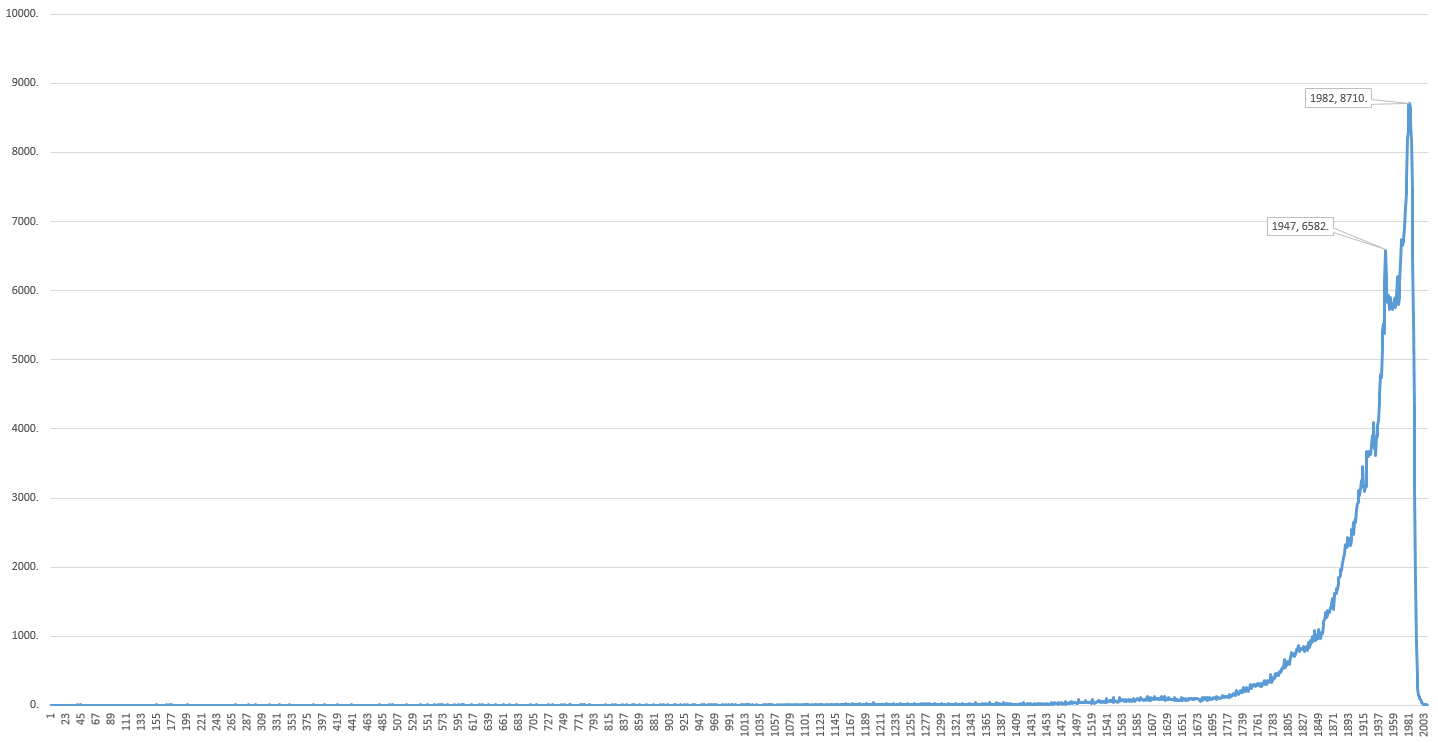
Births
This is graph of people’s births. On the x-axis are years, and on y-axis are number of births (click to enlarge):
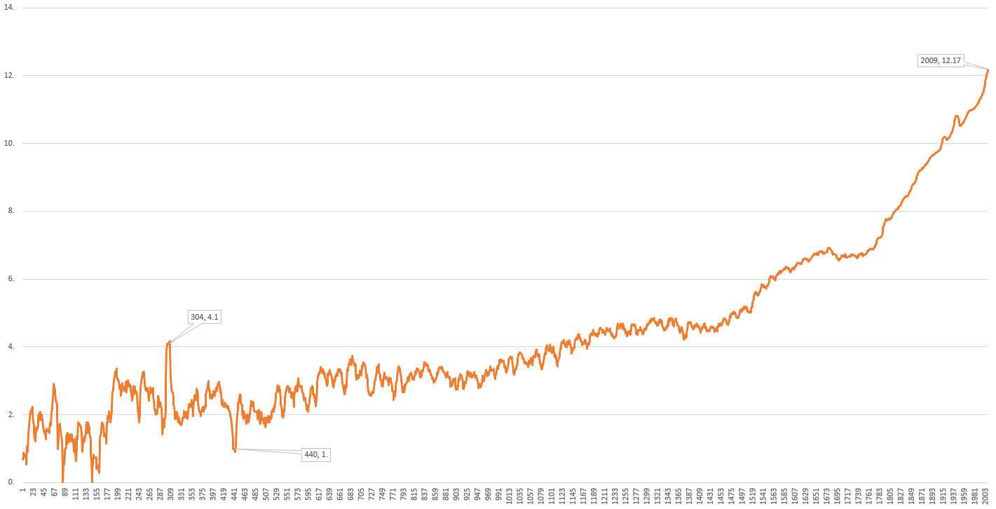
Graph presented above is not very useful, so we’ll construct better one. Graph shown below is constructed by taking averages of births in range of 10 years (to see general trends) and is in logarithmic scale (due to the exponential nature of this kind of data). It reveals much more now (click to enlarge):

Now that we have these graphs, let’s see what we can conclude from them. We’ll start chronologically:
- (red logarithmic graph) There is large rise of births around year 170, mostly all of them are Chinese military generals (you can see that here and here). I don’t know Chinese history, but they all relate to period of Three Kingdom era. Question now is – is this era period of great development in China or is this the period when nothing important happened in Europe?
- (red logarithmic graph) Around 600-1100 you can see there is no rise in birth’s graph. Of course, there should be, because population growth was constant, so I think this could be explained by Dark age period.
- (red logarithmic graph) You can see rise in the first half of 17th century that I can’t explain. Is it large rise or large fall that happened after? Can that large fall be because of some catastrophic events like plague in Europe at that time? Or, there is large, but century long continuous rise because of also some large, but century long continuous catastrophe? Can baby boomer generation happen, but in large scale, spanning for decades? Or maybe it is just a pinnacle of renaissance, so there was a lot of famous people at that time?
- (blue, linear graph) You can see very large rise in births after WWII (concrete year is 1947, you can see that in spreadsheet). I think this is very good visualization of baby boomer generation.
- (blue, linear graph) Highest peak in births is around 1979-1985 (largest number of people born in Wikipedia is in 1982.), so I guess that you can, looking at this, see what is the most probable year of one’s affirmation and recognition. If you’re older than this, then your chances to become famous are becoming slimmer and slimmer every day:)
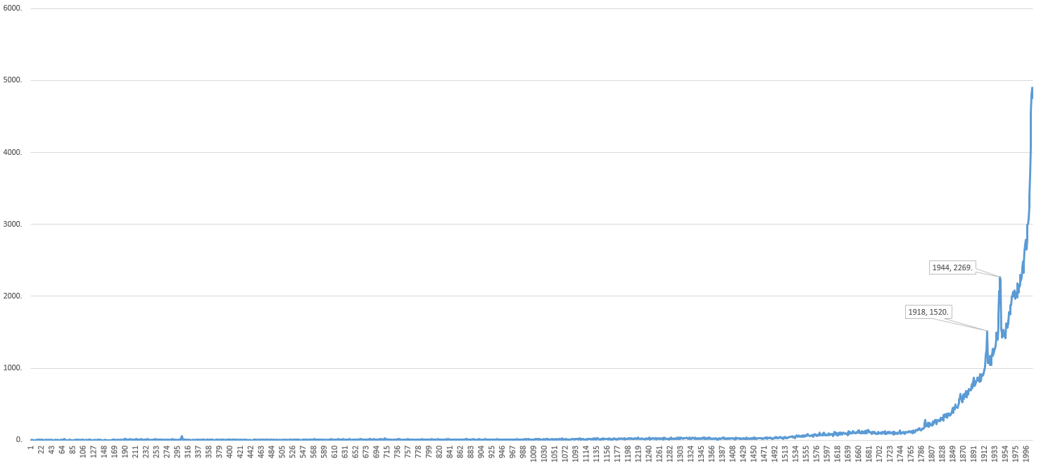
Deaths
Let’s take a look on number of deaths over the years. Here’s a linear graph (click to enlarge):
And here’s the same graph, but averaged in 10 years period and in logarithmic scale (click to enlarge):
Some observations I came up with:
- (red logarithmic graph) The first thing you notice on this graph is a large peak around year 304. Reason is Diocletian persecution of Christians that happened that year and a large number of people that will later become Christian martyrs died. See for yourself.
- (red logarithmic graph) Also interesting is a large drop of deaths around year 440 for which I really don’t have an explanation.
- (red logarithmic graph) As in birth’s graph, here we also see a large rise in deaths between 16th and 17th century (or a large drop of deaths after that?) which is also puzzling for me.
- (blue, linear graph) Sudden jump around 1914-1918 is pretty clear. Deaths of millions, greatest tragedy ever, visualized as just a few pixels…
- (blue, linear graph) Also jump around 1938-1945 shows how many great people died in WWII (and also millions of them unknown, that don’t have their place in Wikipedia…)
- (red logarithmic graph) In contrast to birth’s graph that drops rapidly after 1985., graph of deaths just continues to grow, logically.
Is there anything else you can add to this observations that I missed? Can you explain better than me slopes in these graphs? Let’s squeeze all the facts we can from these data!
[…] ako vam se sviđaju ove moje debilne analize sa ovako random temama, onda će vam se sigurno svidi i datatata blog od mog kolege:) Sad […]
[…] from Wikidata using SPARQL and scrape climate data for those cities from Wikipedia. Same as with my previous explorations in Wikipedia world, I used pywikibot for scraping again. I don’t want to bother anyone with details, but […]